

Canvas
Learning management system-redesign
Canvas
Learning management system-redesign
Canvas
Learning management system-redesign

O V E R V I E W
O V E R V I E W
Canvas redesign addressed cluttered visual structure, confusing navigation, and poor accessibility in the learning management system. The solution enhanced visual hierarchy, consolidated course tabs, and improved shortcuts.
Canvas redesign addressed cluttered visual structure, confusing navigation, and poor accessibility in the learning management system. The solution enhanced visual hierarchy, consolidated course tabs, and improved shortcuts.
M Y R O L E
M Y R O L E
User Research, User Interviews, Analyzing Qualitative & Quantitative Data, Hi-Fi Prototyping, User Interface Design, Usability Testing
User Research, User Interviews, Analyzing Qualitative & Quantitative Data, Hi-Fi Prototyping, User Interface Design, Usability Testing
T E A M
T E A M
UX Designer (me), UX Designers, UI Designers
UX Designer (me), UX Designers, UI Designers
I M P A C T
I M P A C T
36.2% Task Success Rate, 91.1 SUS
36% Task Success, 91 SUS
36% Task Success, 91.1 SUS
D U R A T I O N
D U R A T I O N
March 2024
3 Months
March 2024
3 Months
T O O L S
T O O L S


P R O B L E M O V E R V I E W
P R O B L E M O V E R V I E W
We started by understanding Canvas
struggles across all users
We started by understanding Canvas
struggles across all users
We started by understanding Canvas struggles across all users

Inefficient Visual Structure
Users navigate through a cluttered interface with poor visual hierarchy, hindering their experience.
Inefficient Visual Structure

Navigation Challenges
Users encounter confusing navigation in course sections, leading to misclicks and inefficiencies.
Navigation Challenges

Accessibility Issue
Users find inaccessible features that hinder
effective engagement in daily activities.
Accessibility Issue
Accessibility Issue
Users find inaccessible features that hinder effective engagement in daily activities.

Inefficient Shortcuts
Users struggle with ineffective shortcuts
due to poor naming, size, and placement.
Inefficient Shortcuts

User Retention Issues
Users frequently switch to alternative platforms
for various tasks, disrupting overall efficiency.
User Retention Issues
User Retention Issues
Users frequently switch to alternative platforms for various tasks, disrupting overall efficiency.
D E S I G N P R O C E S S
D E S I G N P R O C E S S
This meant adopting a user-centered
approach to get real answers
This meant adopting a user-centered
approach to get real answers
This meant adopting a user-centered approach to get real answers

U X R
U X R
Our research began with diving
deep into existing problems
Our research began with diving
deep into existing problems
A five-stage process transformed data into actionable
insights for students, professors & administrative staff.
A five-stage process transformed data into actionable insights for students, professors & administrative staff.
A five-stage process transformed data into actionable
insights for students, professors & administrative staff.

- ONLINE SURVEYS: The questionnaire included 10 high-level survey questions, yielding 25 online responses, with 18 respondents expressing interest in participating further.

HEURISTIC EVALUATION
Nielsen's Heuristic Evaluation identified key issues: Information overload, excessive jargon, missing 'Back' buttons, inconsistent layouts and unclear tab functions. These insights informed our design improvements.


P R O J E C T S C O P E
P R O J E C T S C O P E
But we had to make a crucial decision:
who deserves our focus?
But we had to make a crucial decision: who deserves our focus?
As the research progressed, we had to decide who our design should serve.
Students, Professors or Administrative Staff?
Students, Professors or Administrative Staff?
Students, Professors or Administrative Staff?
U S E R A N A L Y S I S
U S E R A N A L Y S I S
We chose students -
they're hit 🥊hardest by usability issues
Creating personas based on real data
We chose students -
they're hit hardest by usability issues
Creating personas based on real data.

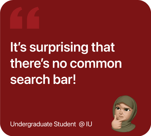
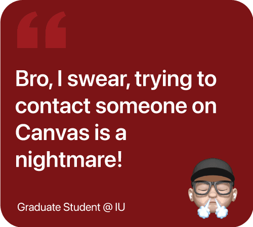
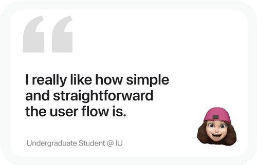
Students had plenty to say about Canvas problems


U S A B I L I T Y M E T R I C S
U S A B I L I T Y M E T R I C S
Then we observed how students
actually interact with Canvas
Then we observed how students
actually interact with Canvas
To gain a deeper understanding, we observed real students using Canvas.
We conducted 10 observational tasks with 16 students to evaluate their interactions with the LMS interface, capturing key usability metrics like Duration, Click Count, Success Rate, and Satisfaction Scores (SEQ and SUS). User performances were measured with KPIs, including Success Rate, Time on Task, and CSAT, providing a comprehensive view of user flow, pain points, and overall experience.
Get High-Res Usability Metrics & KPIs here.

The real breakthrough came when patterns started emerging

I D E A T I O N
I D E A T I O N
While ideating, we asked: what if we just rearranged what was already there?
While ideating, we asked: what if we just rearranged what was already there?
Too many useful features were hidden. We surfaced the best features so students could focus on what mattered.

W I R E F R A M E S
Low-Fidelity

Mid-Fidelity
Further development improved the course landing page and streamlined the messaging system, introducing shortcuts to reduce task time and clicks.
Hi-Fidelity


I S T H E R E D E S I G N E A S Y T O U S E ?
To make sure our ideas worked, we
ran usability tests with the 12 students
To make sure our ideas worked, we ran usability tests with the 12 students


The testing revealed issues we hadn't anticipated
10/12 found the Dashboard cluttered with too many widgets.
12/12 were confused by different colors for subjects in the calendar.
10/12 were confused about finding and messaging people.

U S A B I L I T Y C H A N G E S
U S A B I L I T Y C H A N G E S
From here, we went after the biggest frustrations:
messy dashboards and confusing colors
From here, we went after the biggest frustrations: messy dashboards and confusing colors
From here, we went after the biggest frustrations: messy dashboards and confusing colors
Before - Dashboard
Before - Dashboard
After - Dashboard
After - Dashboard
R E S U L T S
Here's how our changes performed
against the original Canvas
Here's how our changes performed against the original Canvas
The following metrics are based on a comparison with the existing LMS platform and are focused on a selected number of tasks.
Get High-Res Canvas Optimization Blueprint here.
F I N A L S C R E E N S
Finally, we designed solutions that don't 🥊hit them hard anymore
Finally, we designed solutions that don't 🥊hit them hard anymore
F I N A L S C R E E N S
Finally, we designed solutions that don't 🥊hit them hard anymore
C H A L L E N G E 1 / 5
How do we fix the cluttered,
confusing visual hierarchy?
How do we fix the cluttered,
confusing visual hierarchy?
The design enhanced visual hierarchy by employing a vibrant color palette and clear section delineation for visual hierarchy, customizable widgets for task prioritization, and intuitive navigation elements, enhancing usability and accessibility while aligning with heuristic principles.
The design enhanced visual hierarchy by employing a vibrant color palette and clear section delineation for visual hierarchy, customizable widgets for task prioritization, and intuitive navigation elements, enhancing usability and accessibility while aligning with heuristic principles.
C H A L L E N G E 1 / 5
How do we fix the cluttered,
confusing visual hierarchy?
Customizable widgets that adapt to
how each student works
Customizable widgets that adapt to
how each student works
Improved dashboard with
customizable widgets.

Multiple layouts because no two
students are the same

3-Course Dashboard
6-Course Dashboard
C H A L L E N G E 2 / 5
The design optimized course navigation by consolidating tabs into a list layout, enhancing accessibility and reducing navigation time through clear labels, visual hierarchy, and intuitive design, while feedback mechanisms keep users informed and minimize misclicks.
How do we reduce confusing navigation that causes misclicks?
How do we reduce confusing
navigation that causes misclicks?
The design optimized course navigation by consolidating tabs into a list layout, enhancing accessibility and reducing navigation time through clear labels, visual hierarchy, and intuitive design, while feedback mechanisms keep users informed and minimize misclicks.
C H A L L E N G E 2 / 5
How do we reduce confusing navigation that causes misclicks?
C H A L L E N G E 3 / 5
C H A L L E N G E 3 / 5
How do we fix Canvas's accessibility issues?
How do we fix Canvas's accessibility issues?
How do we fix Canvas's accessibility issues?
Enhanced accessibility with a personalized reminders shortcut and a "+" icon for quick To-Do additions, boosting visibility and engagement.
Enhanced accessibility with a personalized reminders shortcut and a "+" icon for quick To-Do additions, boosting visibility and engagement.

C H A L L E N G E 4 / 5
C H A L L E N G E 4 / 5
How do we redesign poorly designed shortcuts?
How do we redesign poorly designed shortcuts?
How do we redesign poorly designed shortcuts?
Improved shortcut effectiveness with clearer naming, larger buttons, and strategic repositioning based on user task flows.
Improved shortcut effectiveness with clearer naming, larger buttons, and strategic repositioning based on user task flows.
The shortcut icon for quick submission, bypassing the lengthy conventional process.
Improved shortcut effectiveness with clearer naming, larger buttons, and strategic repositioning based on user task flows.
C H A L L E N G E 5 / 5
C H A L L E N G E 5 / 5
How do we improve user retention and stop platform switching?
How do we improve user retention
and stop platform switching?
How do we improve user retention
and stop platform switching?
The redesign improves usability by effectively integrating messaging and collaboration tools, enabling seamless peer interactions and access to course histories, which fosters a supportive learning community and drives higher user satisfaction and retention on the platform.
The redesign improves usability by effectively integrating messaging and collaboration tools, enabling seamless peer interactions and access to course histories, which fosters a supportive learning community and drives higher user satisfaction and retention on the platform.
Reflection
Reflection

Let's build a better future together!
Say hi at hitesh.s.bisht7@gmail.com
F E A T U R E D O N


Copyright © 2024 Hitesh Singh Bisht. All rights reserved.
Copyright © 2024 Hitesh Singh Bisht. All rights reserved.
Let's build future together!
Say hi at hitesh.s.bisht7@gmail.com
F E A T U R E D O N
Copyright © 2024 Hitesh Singh Bisht. All rights reserved.