

Unison Design System

Indianapolis Metropolitan Police Department, IN
O V E R V I E W
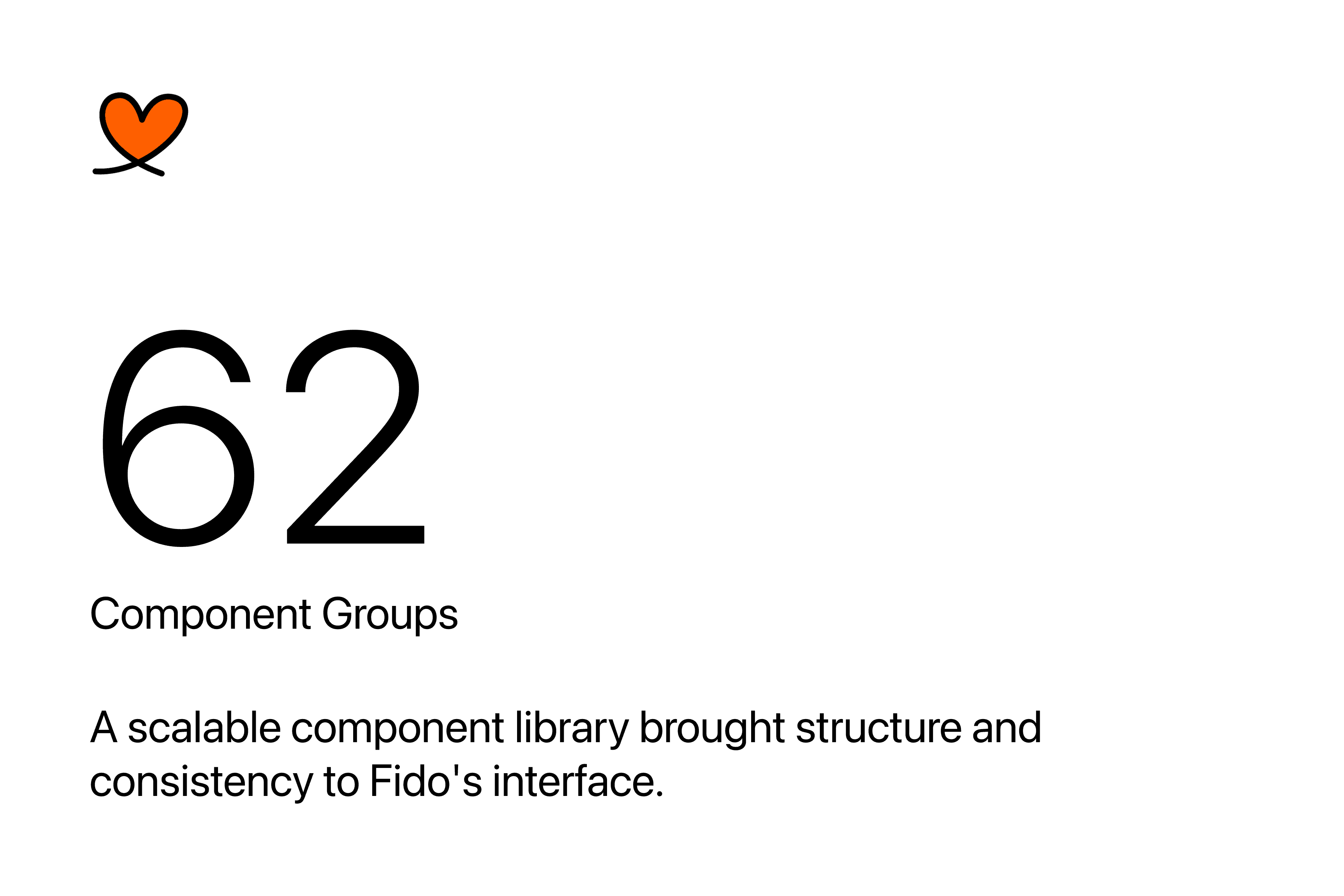
Unison is the design system developed for Fido, establishing reusable
components, design tokens, and visual standards to improve
interface consistency and accelerate design delivery across
investigative workflows.
M Y R O L E
Product Design, Design System Architecture, Component Design,
Design Tokens, UI Documentation
I M P A C T
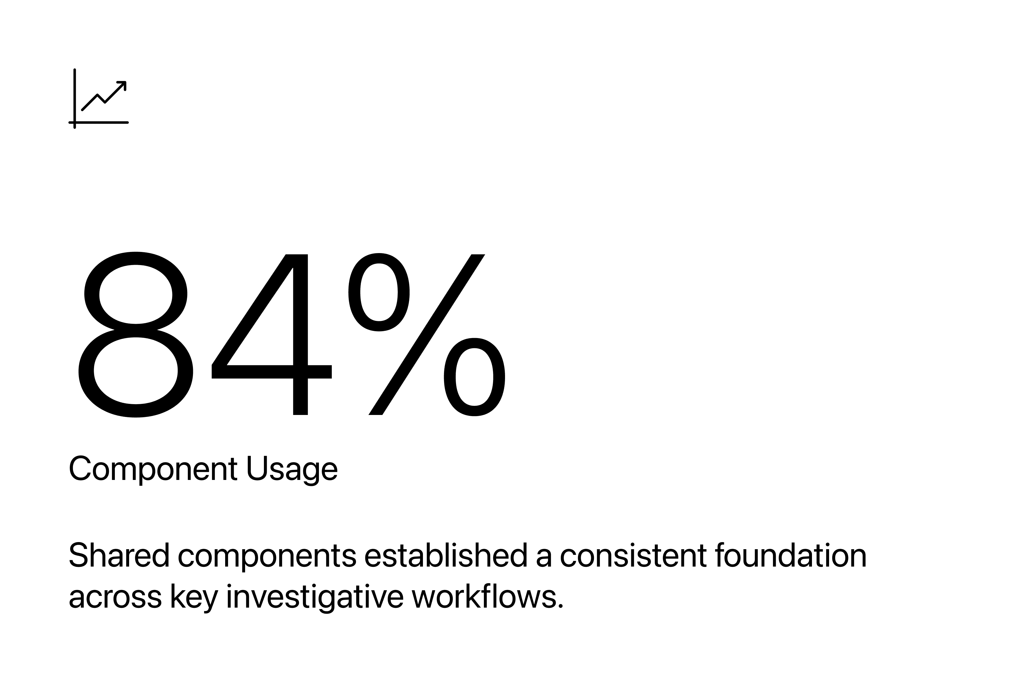
~50% Faster Design Delivery, 84% Component Usage
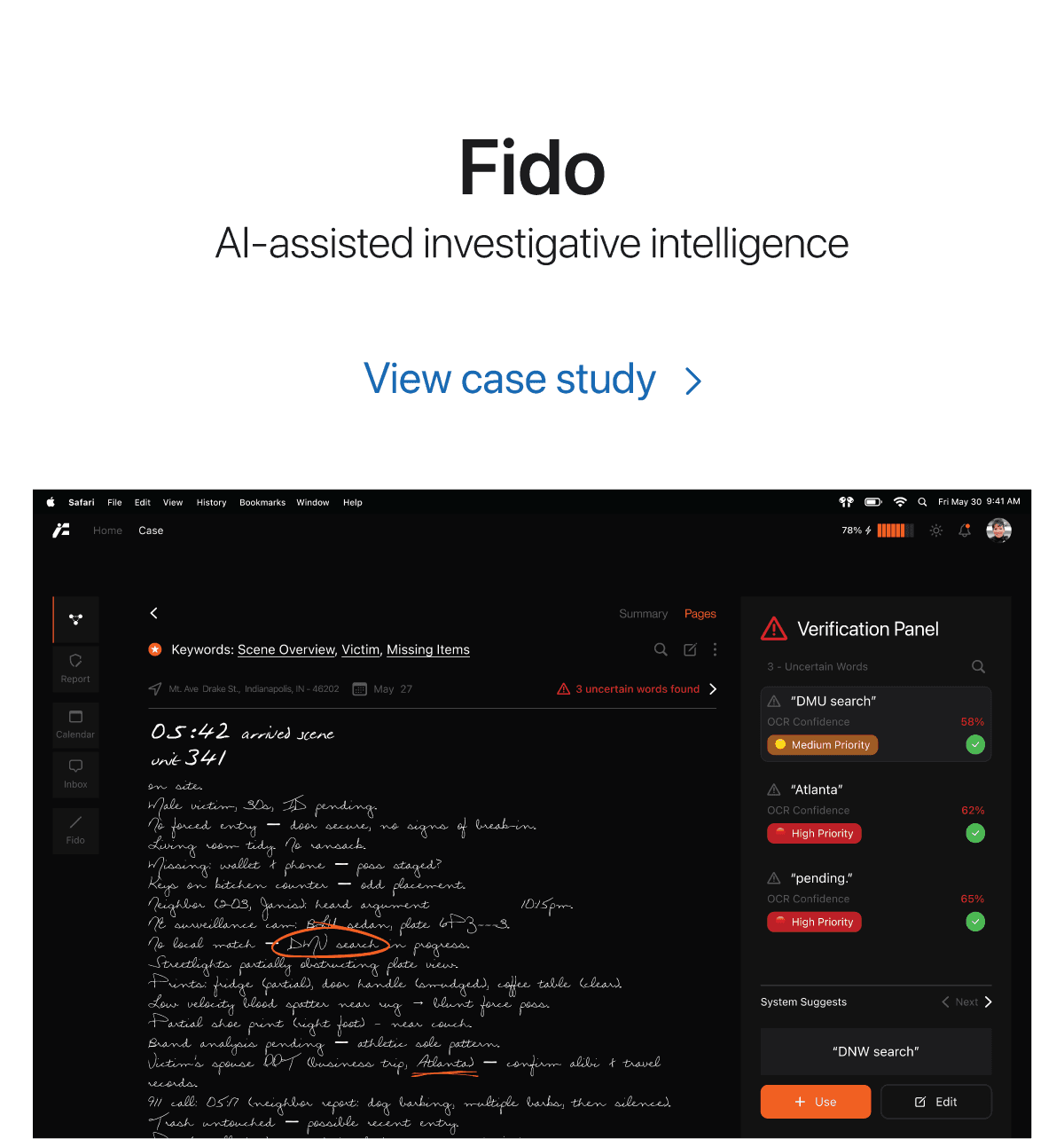
While designing Fido, an investigative tool, we ran into a few challenges.
When we first started designing Fido, our focus was on helping detectives capture, organize, and make sense of investigative information.
But as the product evolved through multiple iterations and usability tests, we started noticing recurring issues with navigation, visual hierarchy, and how information was presented across screens.

The initial design brought case details, maps, notes, and supporting information into a single workspace. However, cluttered navigation, lengthy content, and buried notes made it
difficult for detectives to locate and focus on relevant information.
Iteration 1

Iteration 2
Iteration 3
To bring consistency across Fido, we created
Unison
Unison brought Fido's visual language, UI components, and interaction patterns into one cohesive system. From typography and colors to reusable components and investigative workflows,
we established a shared foundation to reduce inconsistencies, streamline design decisions, and support the product as it evolved.

&
this is how we build it.
U N I S O N - D E S I G N S Y S T E M D E V E L O P M E N T P R O C E S S
0 6 P H A S E S
We started by auditing Fido's existing interface to identify recurring inconsistencies and prioritize key improvements. From there, we established a unified visual direction, defined the design
foundations, and built reusable components. We then refined these components within actual product workflows to ensure consistency and flexibility across the experience.
1
Review existing screens, recurring
patterns, and inconsistencies.

2
Identify duplication, gaps, and opportunities for standardization.

3
Determine which foundations and components to establish first.

4
Define naming conventions, token relationships, and component structure.

5
Build, refine, and organize reusable components in Figma.

6
Evaluate components in Fido's workflows and resolve inconsistencies.

First, we laid the groundwork.
01 COLORS
02 TYPOGRAPHY
03 ICONS
04 SPACING
05 COMPONENTS
06 LOGO
07 PRODUCT IDENTITY
To build a scalable and consistent design system, we started by establishing a strong foundation. We defined shared principles
for color, typography, iconography, and spacing to create a unified visual language that could evolve alongside Fido.
F O U N D A T I O N 1 / 7
Colors
DESIGN CONSIDERATION
Fido's dark interface brings together case information, AI interactions, and multiple investigative tags. Colors needed to distinguish these elements without overwhelming an already information-dense workspace.
DESIGN DECISION
We established a dark-first palette with orange for primary interactions and distinct colors for investigative tags and priority states, creating visual separation while maintaining a cohesive interface.
F O U N D A T I O N 2 / 7
Typography
DESIGN CONSIDERATION
Detectives work across lengthy notes, transcripts, case details, and supporting metadata. The type system needed to make different levels of information easy to distinguish and scan.
DESIGN DECISION
We selected Inter and defined a hierarchy of headings, subtitles, body text, and captions, using consistent sizes, weights, and line heights to organize investigative content.


F O U N D A T I O N 3 / 7
Icons

DESIGN CONSIDERATION
Fido relies on icon-based actions across navigation, evidence management, recording, and document tools. These controls needed to remain recognizable at small sizes within a compact interface.
DESIGN DECISION
We developed a consistent icon language using restrained strokes, standardized proportions, and construction guidelines to keep controls visually aligned across the product.

And we also played around with how
files and folders should look
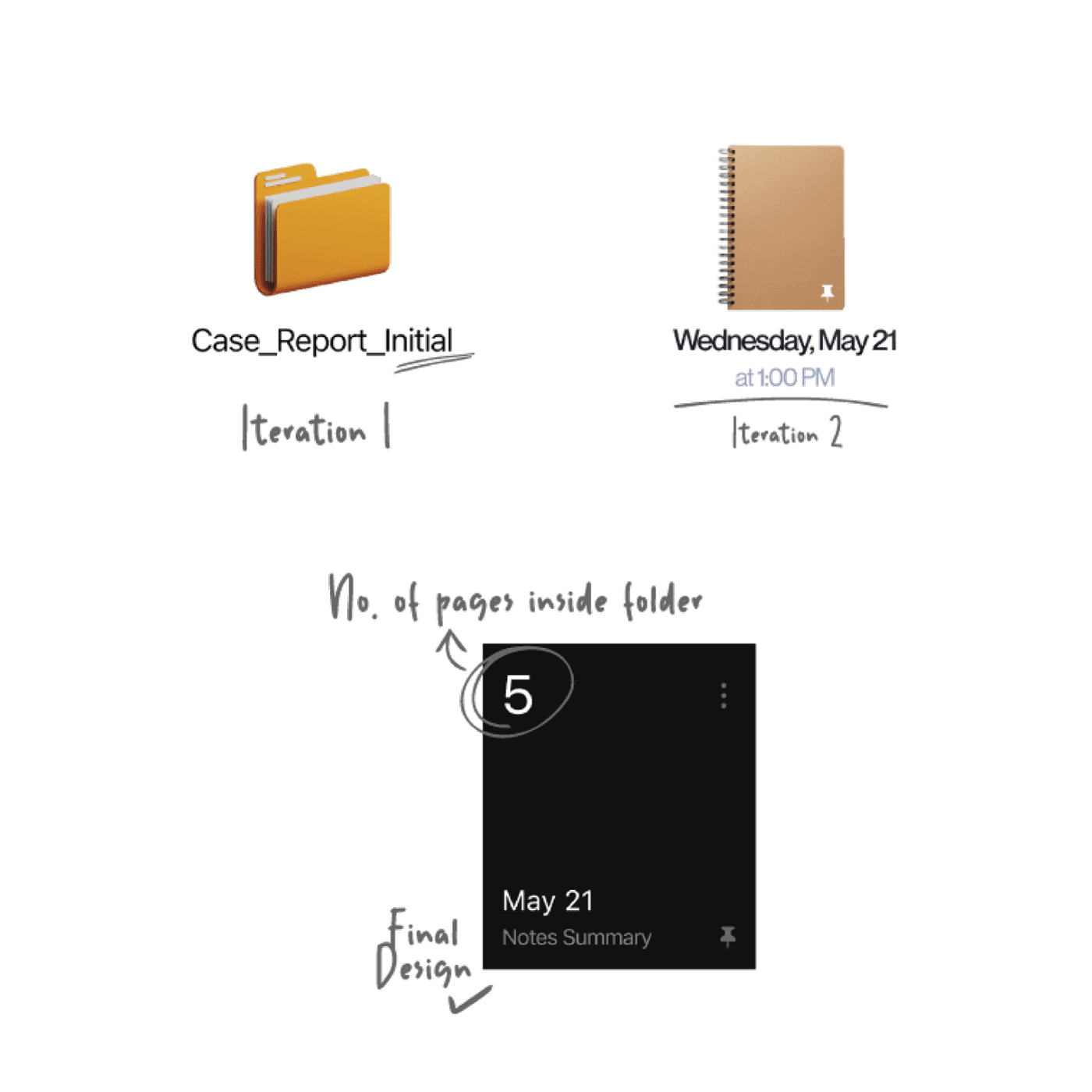
Note folder design exploration.
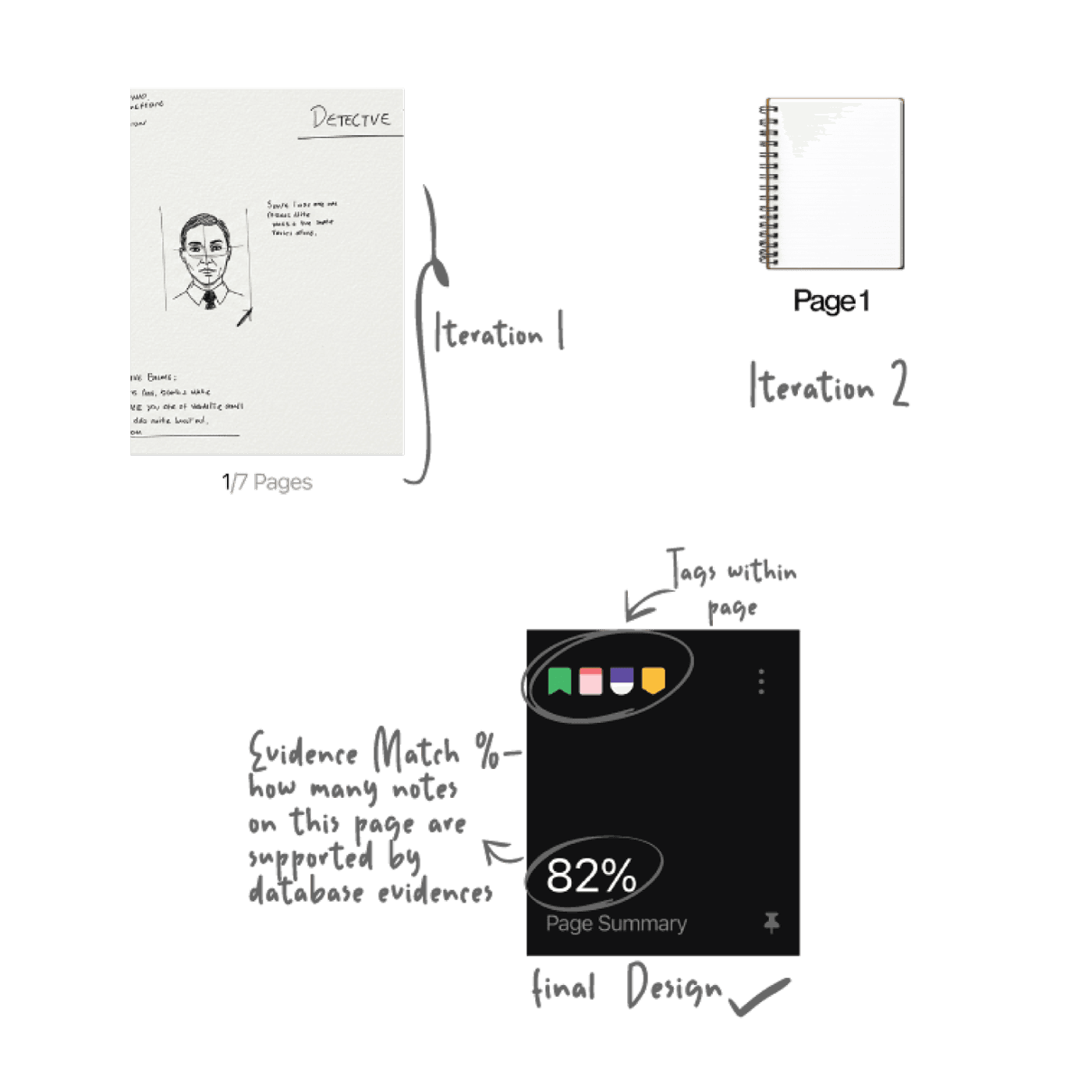
Once note folder was designed, we
moved to the pages (file) within.
F O U N D A T I O N 4 / 7
Spacing
DESIGN CONSIDERATION
Investigation screens combine navigation, case files, metadata, and detailed notes within limited space. Spacing needed to establish hierarchy without reducing the amount of information visible.
DESIGN DECISION
We defined consistent spacing rules for content groups, navigation, and file layouts, using tighter spacing within related elements and greater separation between sections.


Architecting a
Scalable
Token System
DESIGN CONSIDERATION
The same colors serve different purposes across Fido, from primary actions to investigative tags. Managing them as isolated values would make their relationships difficult to maintain.
DESIGN DECISION
We structured the color system into three tiers —primitive, semantic, and component-specific tokens— to separate raw values from their intended meaning and application.

Anyway, back to the building blocks of a consistent experience.
F O U N D A T I O N 5 / 7
Components
Variants · States · Patterns
Note Card
Radio Button
Primary Button

Contextual AI Assistance
Navigation Sidebar
Action Toolbar
Interactive Transcript Message
B R A N D 6 / 7
Logo
DESIGN CONSIDERATION
The product needed a name that felt familiar to law enforcement rather than introducing an entirely unfamiliar identity. We drew inspiration from police K-9 units and the familiar dog name Fido, associated with loyalty and trust.
DESIGN DECISION
We chose Fido as the product name and developed a distinctive geometric mark with a compact silhouette, creating a recognizable identity that could extend across digital and physical applications.




B R A N D 7 / 7
Product Identity
DESIGN CONSIDERATION
Fido was envisioned for investigative workflows that extend beyond a computer screen. Its identity needed to translate naturally to physical tools and case-related materials.
DESIGN DECISION
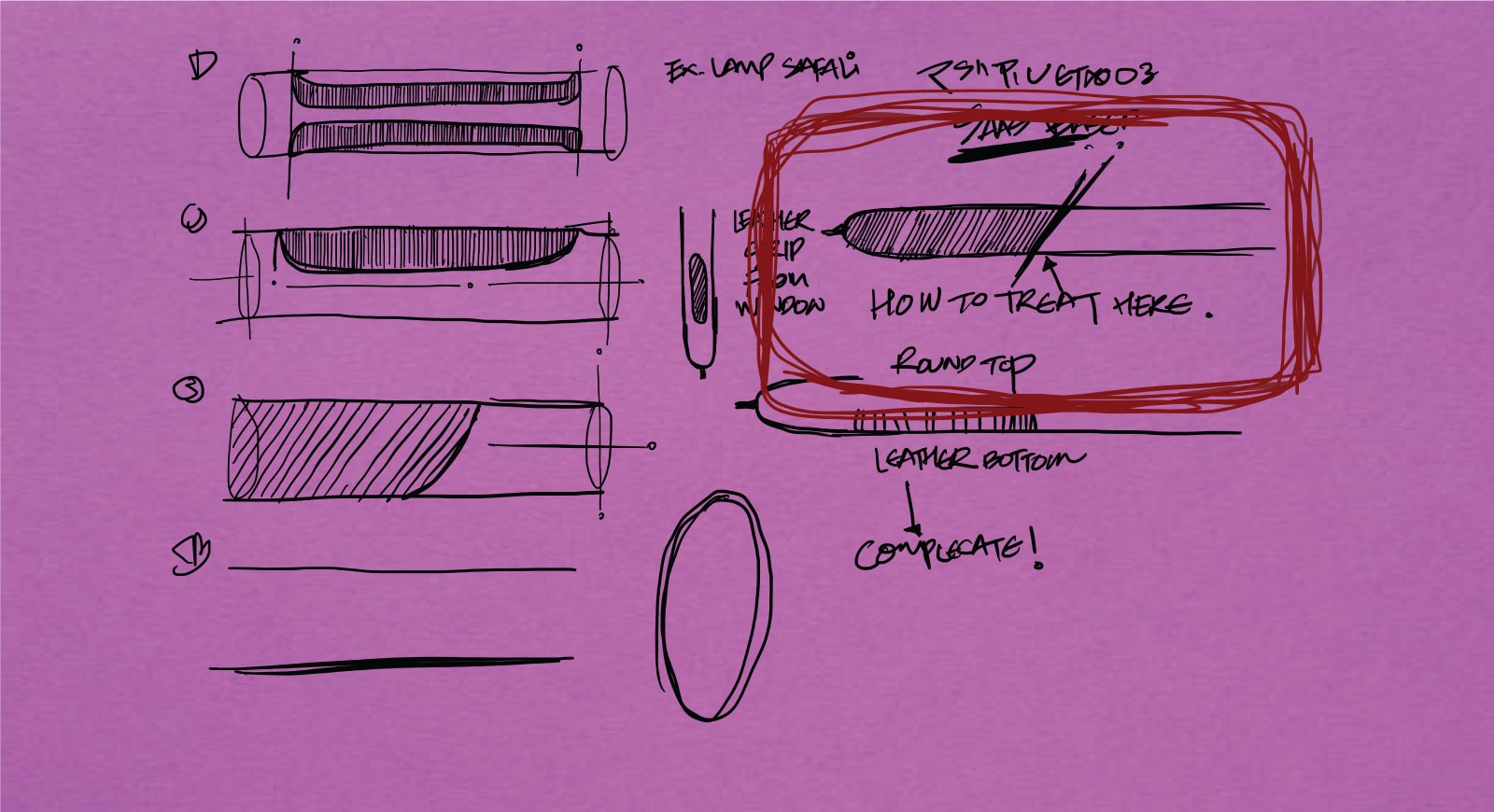
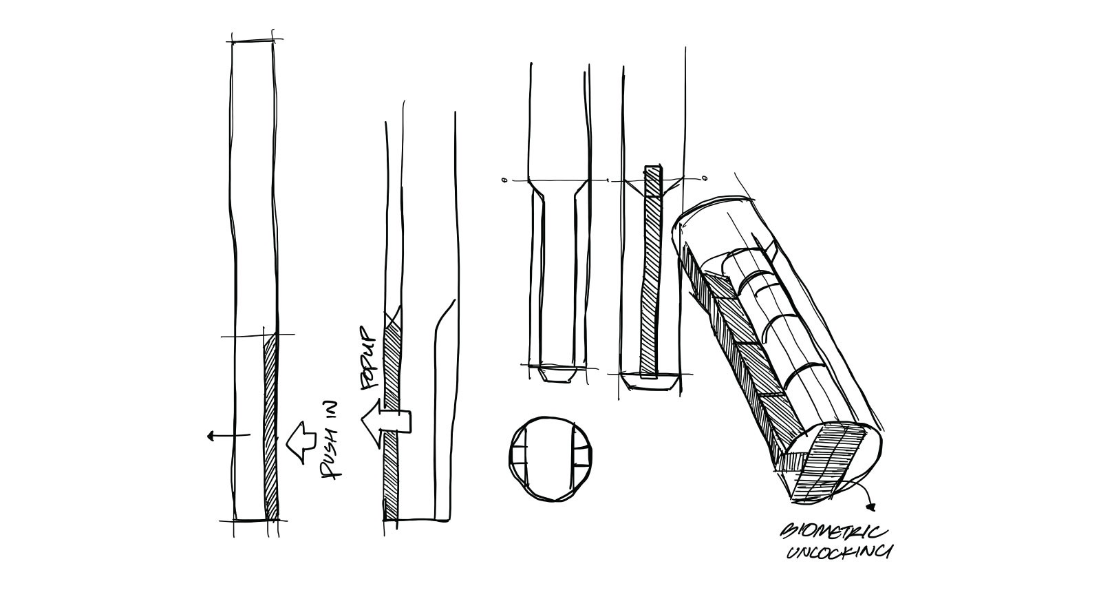
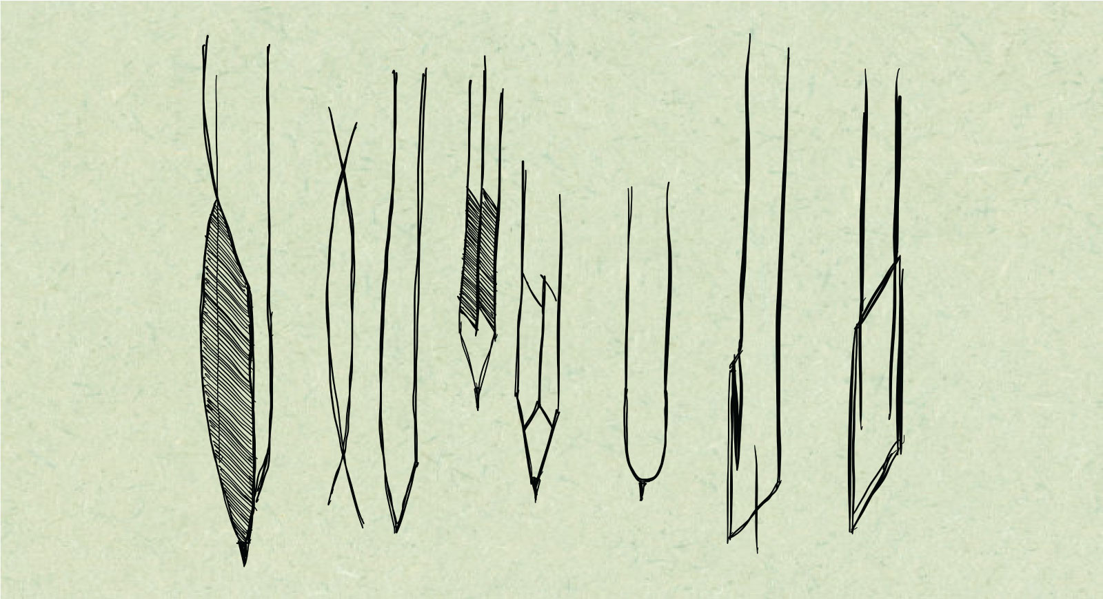
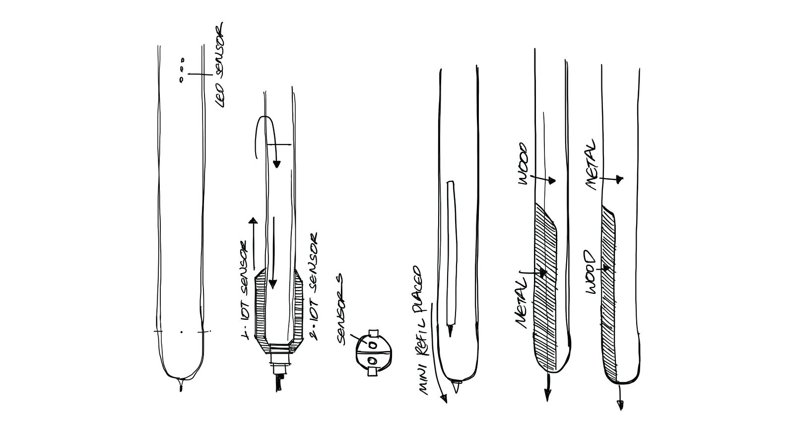
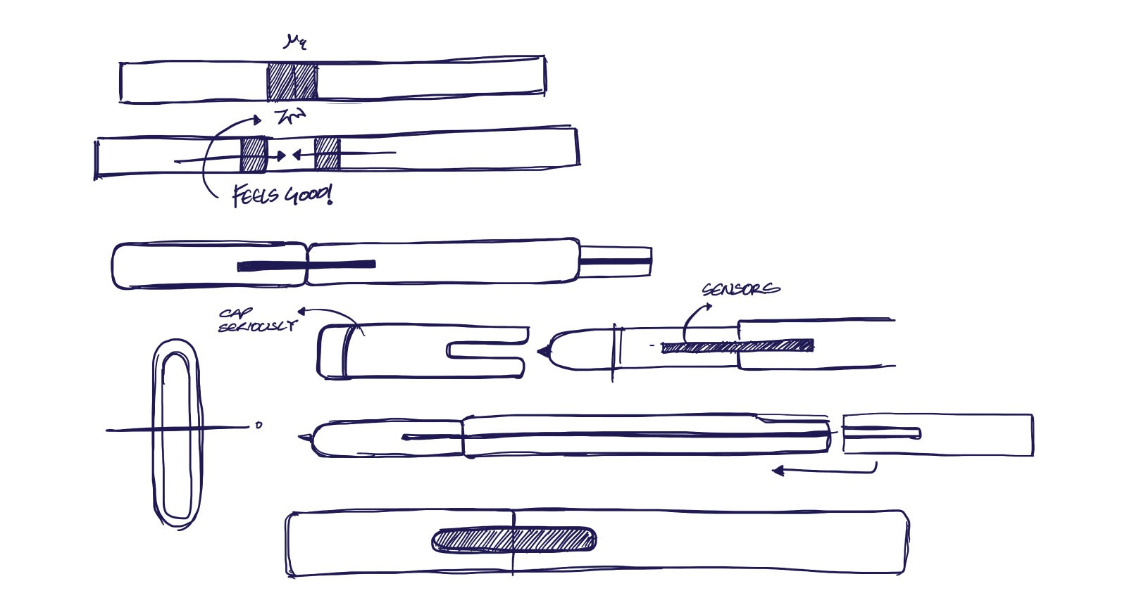
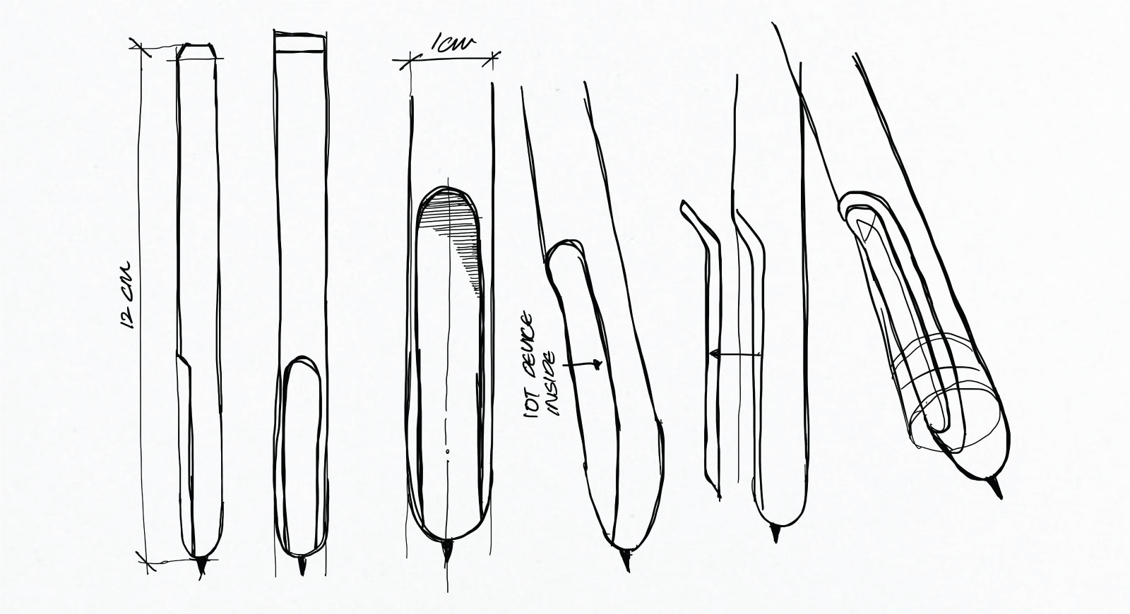
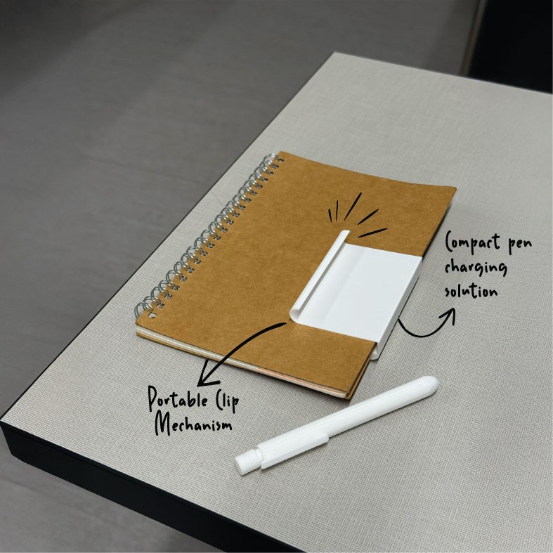
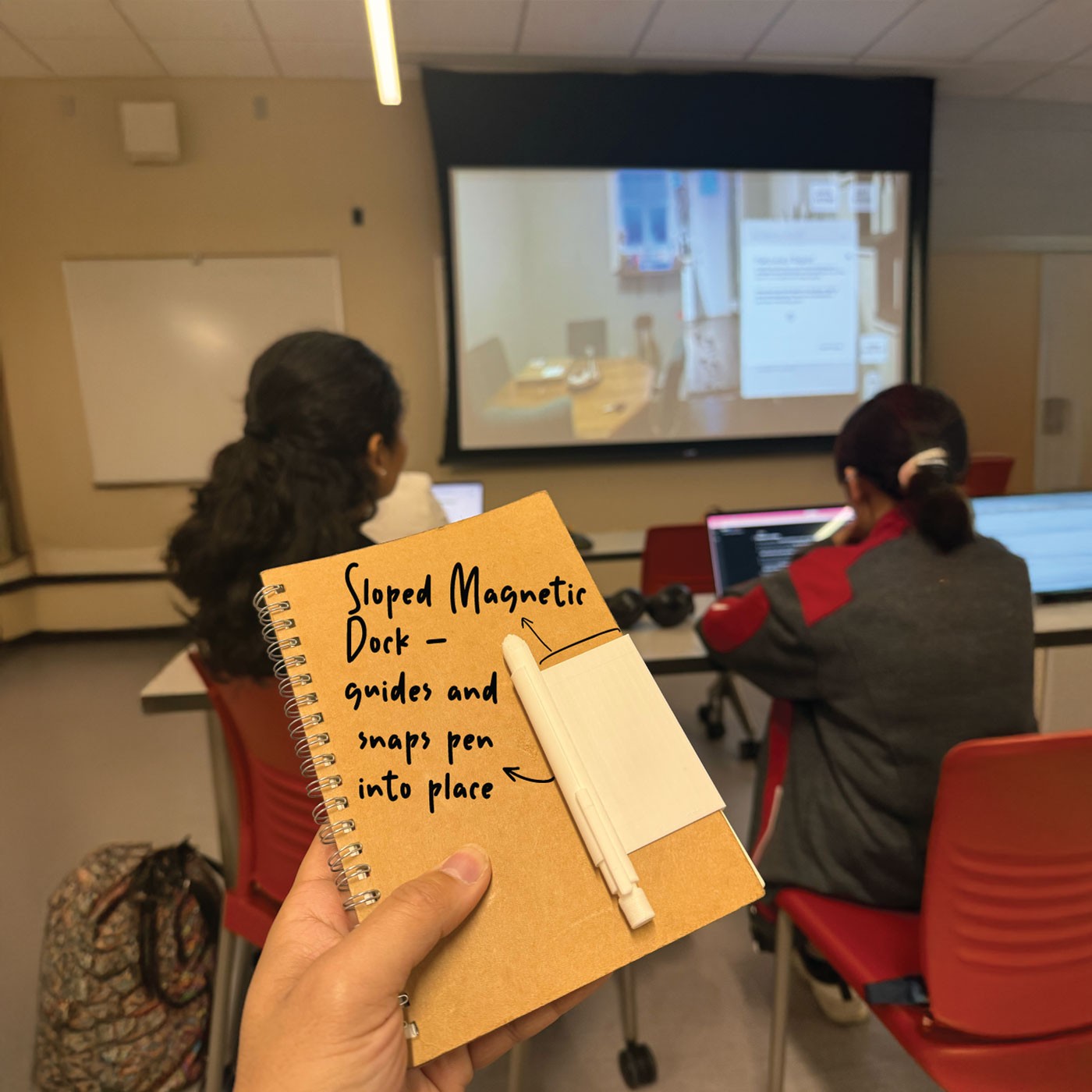
We explored the identity across investigative documents, folders, and a branded pen concept, adapting the logo, materials, and visual treatments to create continuity between physical and digital touchpoints.

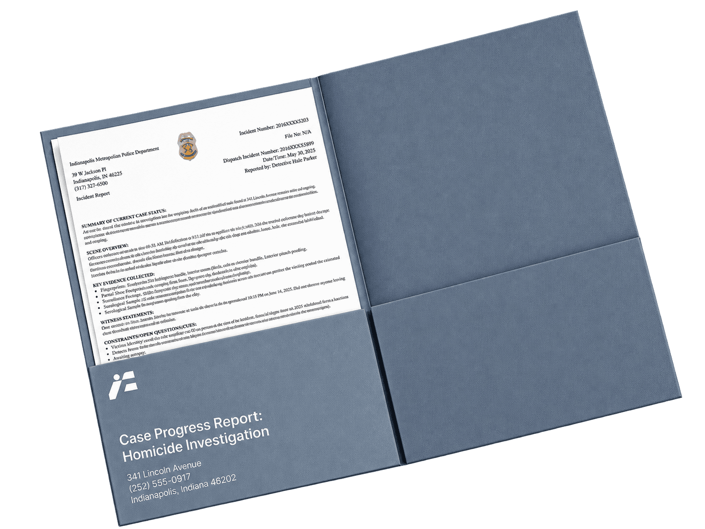

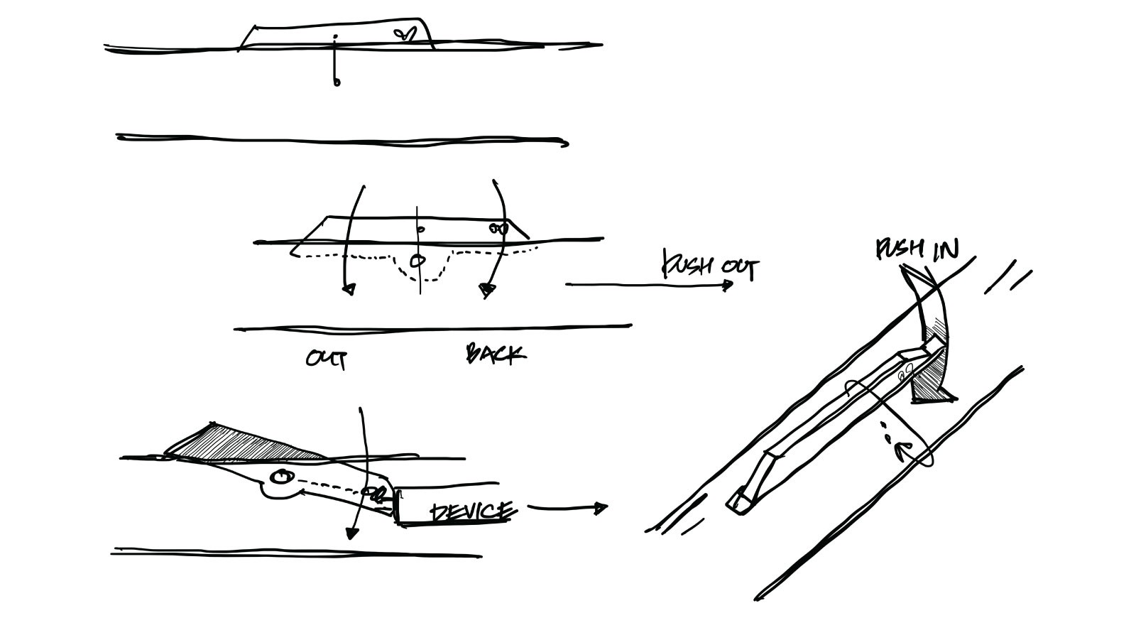
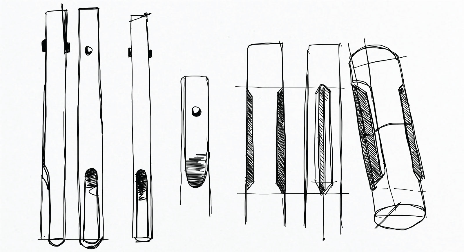
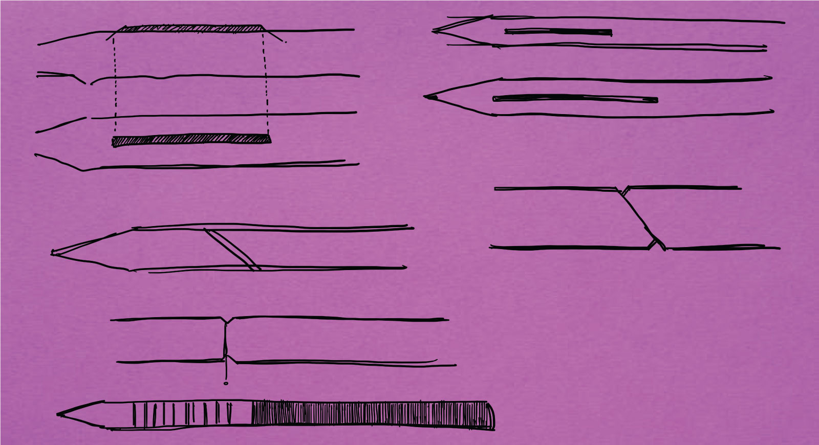
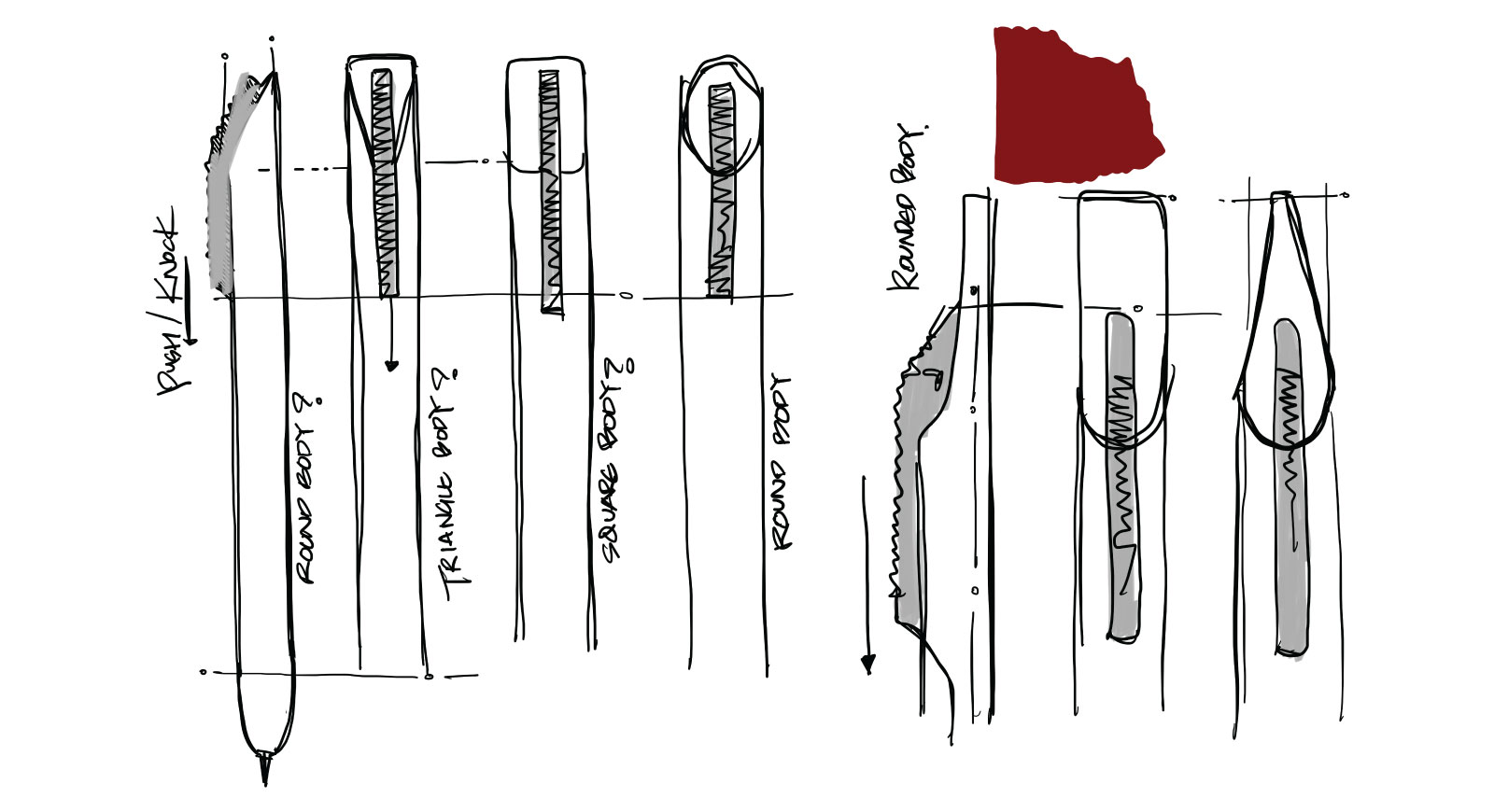
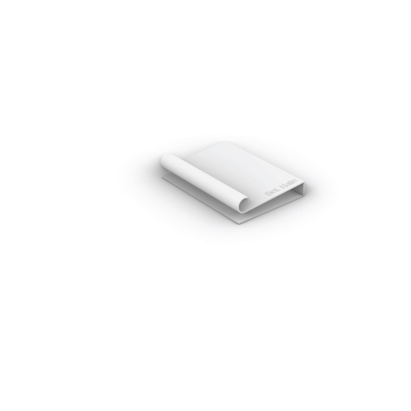
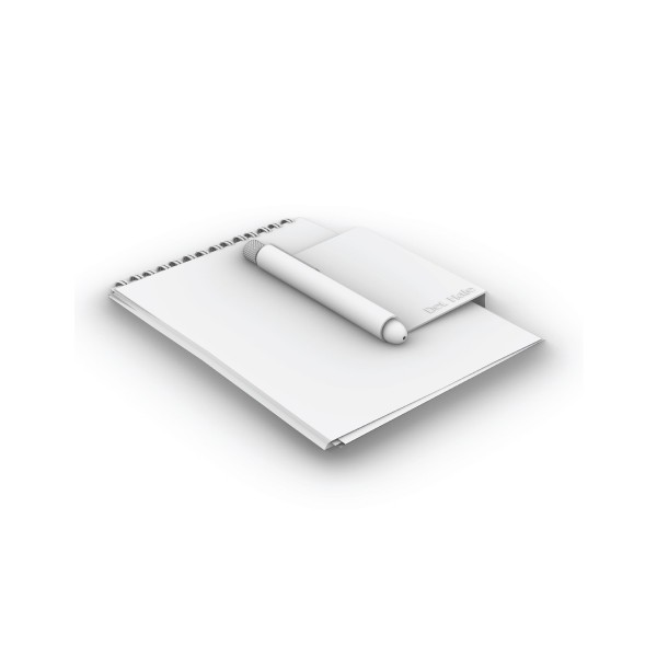
And it all connects back to a smart pen 👾
FYI — in case you skipped the 🔗 Fido case study


*Created using ChatGPT
Developed through 65+ sketches across
30+ pages into one compact, versatile design.

















Results

M O R E C A S E S T U D I E S
© 2026 — All rights reserved